
Crevano · Templates · Social Media Templates
Social Media Templates
24 templates at the exact pixel sizes the platforms publish — posts, stories, pins, thumbnails, channel art and profile pictures — with the crop and the safe area drawn where each platform actually puts them. No trim, no bleed, no paper.
| Trim sizes | 2000 × 2000 px · 2560 × 1440 px · 1000 × 2100 px · 1080 × 1920 px · 1920 × 1005 px · 1000 × 1500 px · 1080 × 1350 px · 1600 × 900 px · and more |
|---|---|
| Bleed | none |
| Resolution target | 72 DPI |
| Templates | 24 |
| Pages | 24 |
No templates match that.
Social media templates (24)
 Minimalist LinkedIn Profile BannerPro
 Clean Etsy Shop Cover BannerPro
 Warm Email Newsletter Header
 Minimal X Header BannerPro
 Minimal Facebook Group CoverPro
 Professional LinkedIn Hiring PostPro
 Bold Facebook Event BannerPro
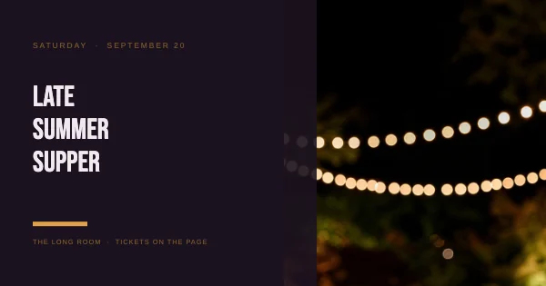 Bold Facebook Event PostPro
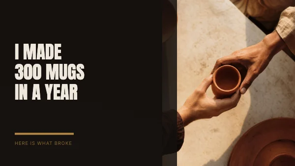 Bold YouTube ThumbnailPro
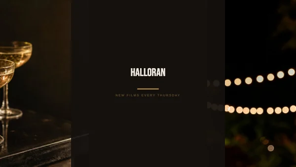 Bold YouTube Channel BannerPro
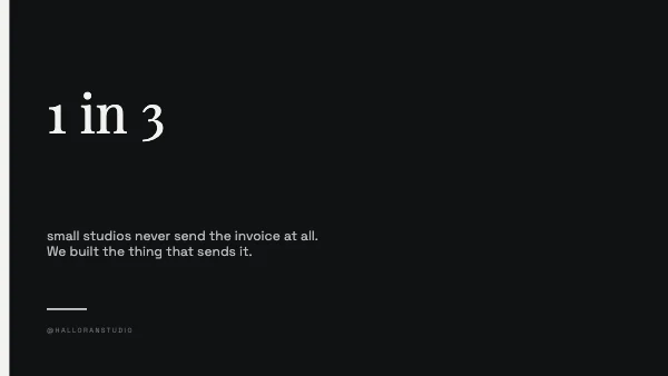 Minimalist X Post ImagePro
 Minimalist Social Profile PicturePro
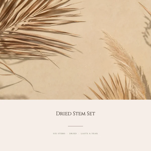 Elegant Etsy Listing PhotoPro
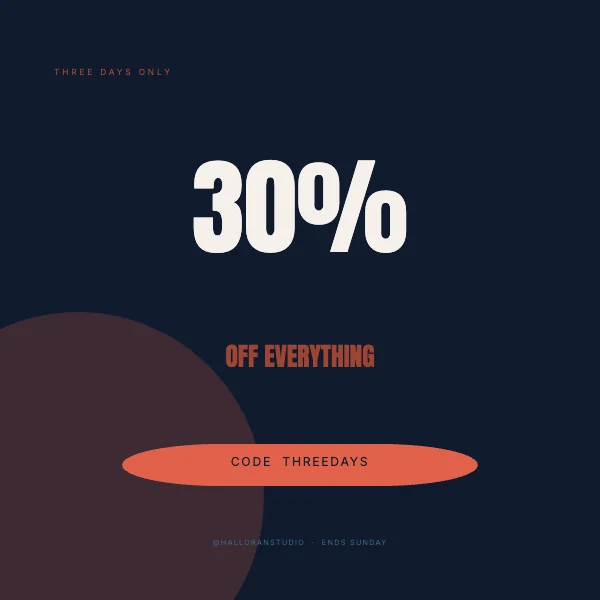 Bold Instagram Sale PostPro
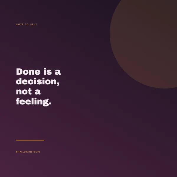 Bold Instagram Quote Post
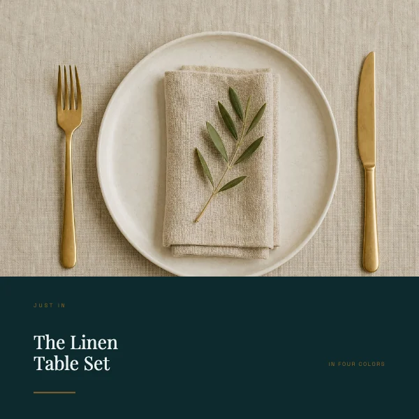 Editorial Instagram New Arrival PostPro
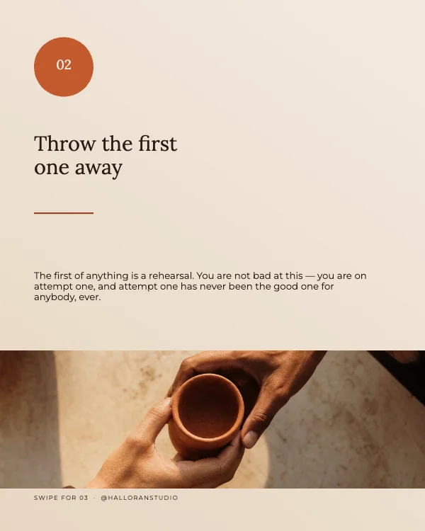 Warm Instagram Carousel SlidePro
 Bold Instagram Carousel Cover
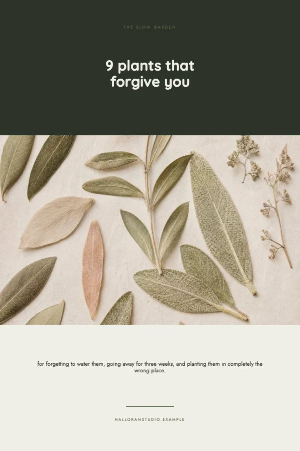 Clean Pinterest PinPro
 Warm TikTok Video Cover
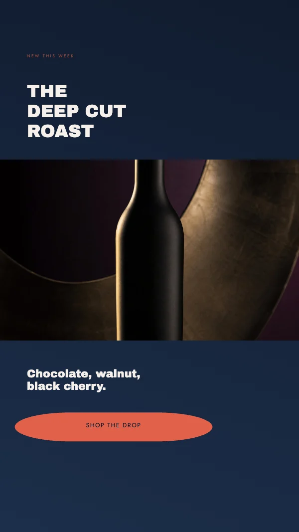 Modern Instagram Story PromoPro
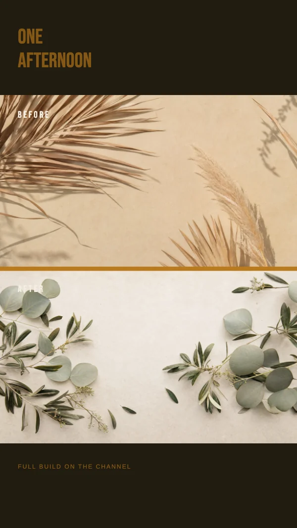 Bold YouTube Shorts CoverPro
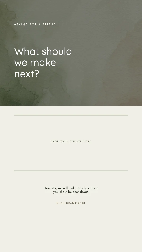 Clean Instagram Story QuestionPro
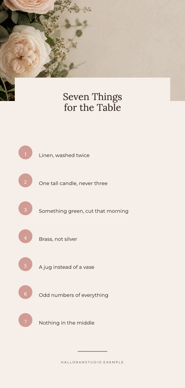 Elegant Pinterest Tall PinPro
Sized in pixels, because nothing here touches paper
Every other category on this site is measured in inches, because it gets cut. These are measured in pixels, because the platform is going to display them at an exact size and then resample them. There is no trim, no bleed and no DPI target that means anything — a screen has no inches.
That changes one practical thing: the resolution check on these templates is judged against the screen target, not against 300. A photograph that would be flagged as too soft on a printed card passes here, because at 1080 pixels wide it genuinely is fine. The app judges every document against its own target rather than a fixed number, which is why these behave differently and correctly.
The safe area is the whole job
A social template is mostly a cropping problem, and the crop is different on every surface.
- A feed post gets cropped. A 1080 × 1350 portrait post shows in full in the feed and as a center square in the profile grid. Anything in the top or bottom fifth is invisible on the grid.
- A story has furniture over it. The top of a 1080 × 1920 story carries the account name and progress bars; the bottom carries the reply box, and on some surfaces a link sticker. Keep everything meaningful in the middle roughly 1080 × 1420.
- A channel banner is the extreme case. YouTube channel art is uploaded at 2560 × 1440 and the part guaranteed to be visible on every device is only about 1546 × 423 in the middle. Put the channel name there and treat the rest as background that mobile will never see.
- A profile picture is cropped to a circle. Corners are gone. Anything that fills the square is losing about 21% of its area.
The templates draw these zones. The single most common social design error is not a bad layout — it is a good layout with the important part in a region that gets cut.
Legibility on a phone, at the size it is actually seen
A feed post is roughly two and a half inches tall on a phone held at arm's length. That is smaller than the thumbnail in the grid above, and it is the size every decision should be checked at.
Two rules that hold up: no more than about eight words at the largest size, and no type below roughly 3% of the image height — on a 1080-tall post, that is around 32 pixels, and anything under it is decoration. The instinct to add a second and third line of supporting text is almost always wrong; the supporting text belongs in the caption, which is free, unlimited and searchable.
Export format, and why the file gets bigger than you expect
Use PNG for anything with type or flat color, and JPEG for anything that is mostly a photograph. That is not a preference — a JPEG compresses by discarding high-contrast edge detail, and the highest-contrast edges in any design are the letters. Type on a JPEG at moderate quality picks up a visible halo, particularly saturated type on a saturated field.
Every platform re-compresses whatever you upload, so upload the cleanest version you have and let them degrade it once rather than twice. Uploading an already-compressed JPEG means the artifacts compound.
The one thing print people get wrong here, and the reverse
Coming from print, the instinct is to design at 300 DPI and scale down. Do not — design at the pixel size, because the pixel size is the actual size. A 1080 × 1080 post is 1080 × 1080, full stop.
Coming the other way is worse: a social graphic will not print. A 1080 × 1080 post is 3.6 inches square at 300 DPI, and it looks exactly like what it is if someone puts it on a flyer. If a design needs to do both jobs, build the print version first at its real trim, then export a screen-sized copy from it. Going the other direction never works.
Questions
What size should an Instagram post be?
1080 × 1350 pixels for a portrait post, which takes the most feed space, or 1080 × 1080 for a square. Both crop to a center square in the profile grid, so keep anything essential out of the top and bottom fifth.
What size is a story?
1080 × 1920 pixels. Keep the important content within the middle 1080 × 1420 — the top carries the account name and progress bars and the bottom carries the reply box, and both sit over your design.
Why do these have no bleed?
Because nothing is being cut. Bleed exists so a trimming blade has somewhere to be wrong, and a screen has no blade. What replaces it here is the safe area, which is where the platform's own interface sits over your image.
Does DPI matter for social media?
No. A screen has no inches, so pixels per inch is meaningless — only the pixel dimensions matter. The app judges photographs against the document's own target, which is why a picture flagged as too soft for print passes here.
Should I export PNG or JPEG?
PNG for type and flat color, JPEG for photographs. JPEG compression damages exactly the high-contrast edges that letters are made of, and the platform will compress your file again on upload, so give it the cleanest version you have.
What size is a YouTube channel banner?
Upload at 2560 × 1440, and keep everything essential inside the middle 1546 × 423 — that is the only region guaranteed to be visible on every device. Everything outside it is background that most viewers never see.
Can I print a social media template?
Not usefully. A 1080 × 1080 post is 3.6 inches square at 300 DPI and will look soft at any real print size. Build the print version first at a real trim and export a screen copy from it; the reverse never works.
Why does my text look fuzzy after uploading?
Because the platform re-compressed it, and compression hits letterforms hardest. Upload a PNG rather than a JPEG for anything type-heavy, and upload at the exact size the platform asks for so it does not resample as well as recompress.
Can I use these for a business account?
Yes, including commercially, on the free plan — no watermark, no royalty, no credit, and it does not expire. That covers client work as well as your own accounts.
Where to go next
Sizes in this category
- Etsy Shop Templates
- Facebook Cover Templates
- Facebook Event Templates
- Instagram Carousel Templates
- Instagram Post Templates
- Instagram Story Templates
- LinkedIn Banner Templates
- LinkedIn Post Templates
- Pinterest Pin Templates
- Profile Picture Templates
- X and Twitter Header Templates
- YouTube Banner Templates
- YouTube Thumbnail Templates
Put together an occasion
Every category
How printing works
Open any of these and it is already the right size. Bleed, margins and trim are set, and there is no watermark on anything you export — on any plan, ever.