
Crevano · Templates · Infographic Templates
Infographic Templates
28 drop-in chart pages for a document you have already started, including the KPI band over a plot, the before and after, the ranked bar, the donut with its legend and the small multiples. Every one is a real, editable chart rather than a picture of one. All at 8.5 × 11 and 300 DPI, so they print into a report rather than only looking right on a screen. The org chart, timelines and SWOT grid are on report pages.
| Trim size | 8.5 × 11 in |
|---|---|
| Bleed | 0.125 in |
| Resolution target | 300 DPI |
| Templates | 28 |
| Pages | 28 |
No templates match that.
Infographic templates (28)
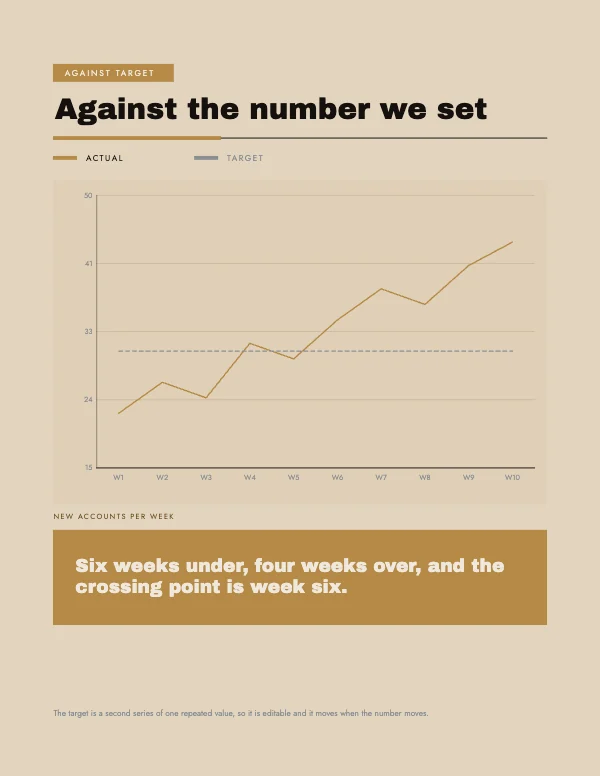 Against Target Chart Block
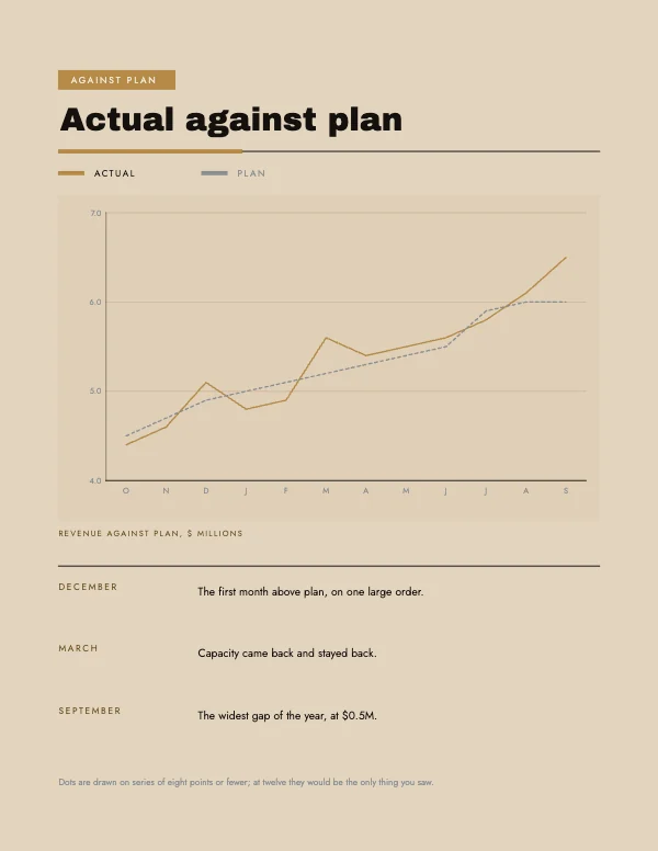 Trend Against Plan Chart BlockPro
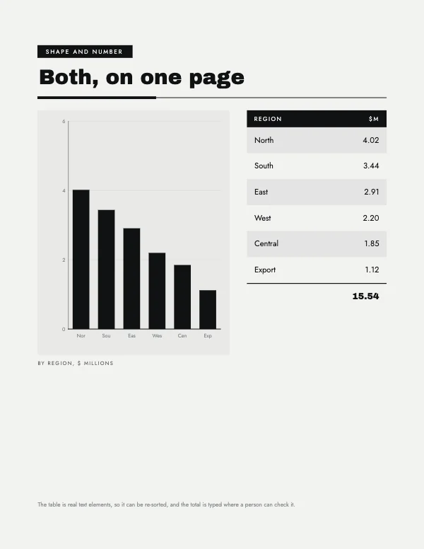 Chart Beside Table Block
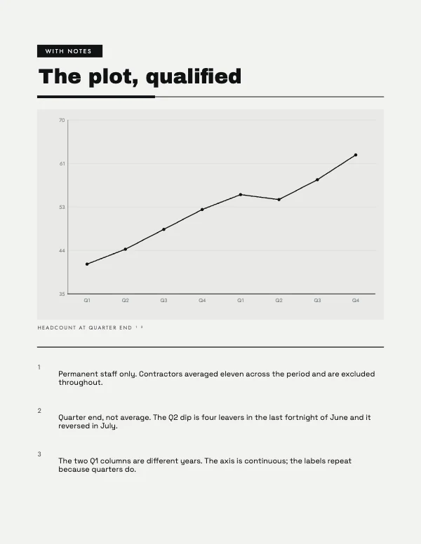 Footnoted Chart BlockPro
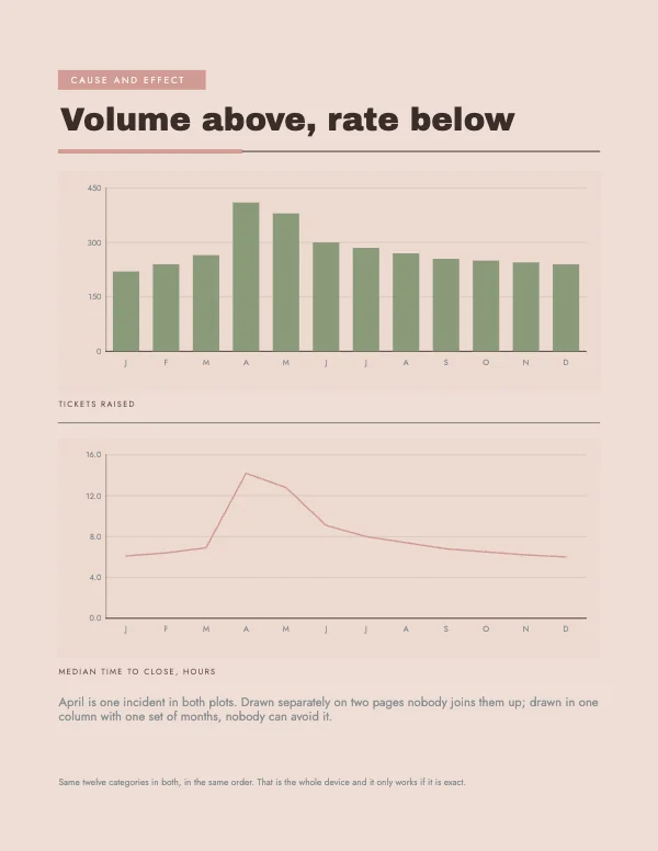 Stacked Plot Pair BlockPro
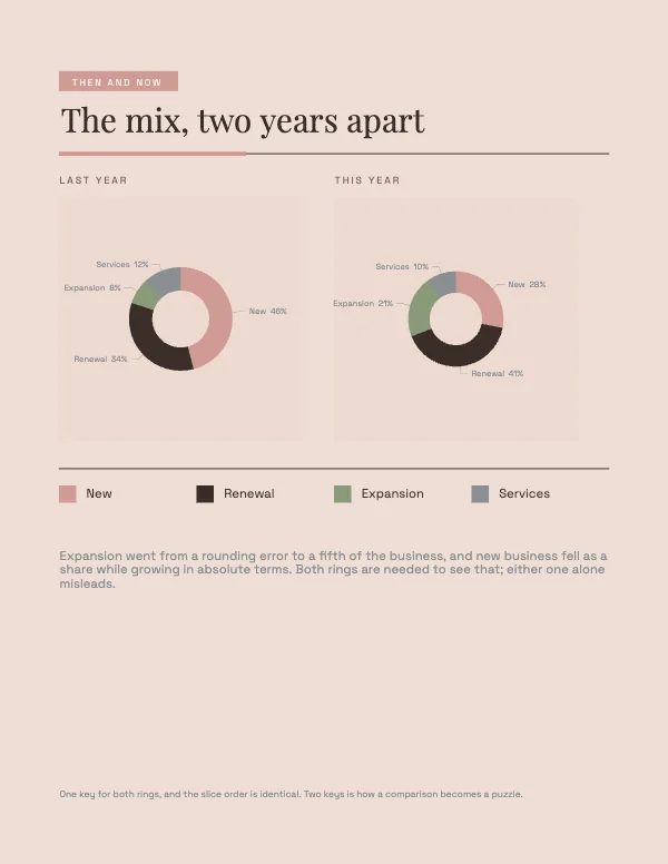 Two Rings Comparison BlockPro
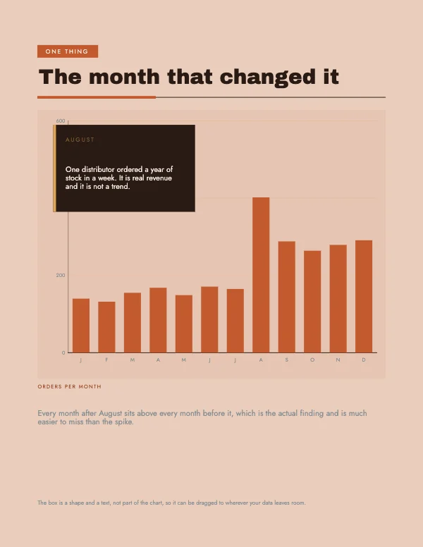 Chart with Callout BlockPro
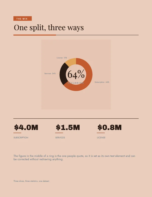 Ring and Statistics BlockPro
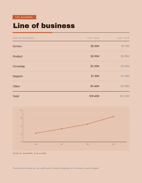 Table and Chart BlockPro
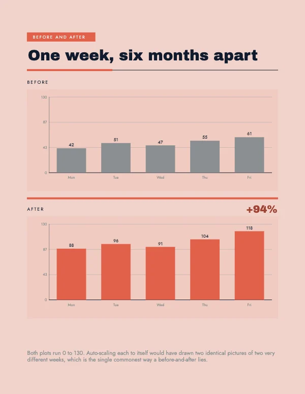 Before and After BlockPro
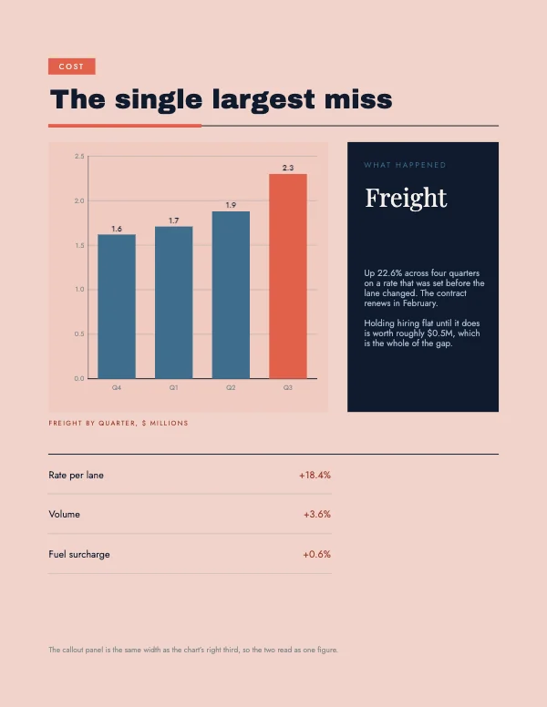 Chart and Callout BlockPro
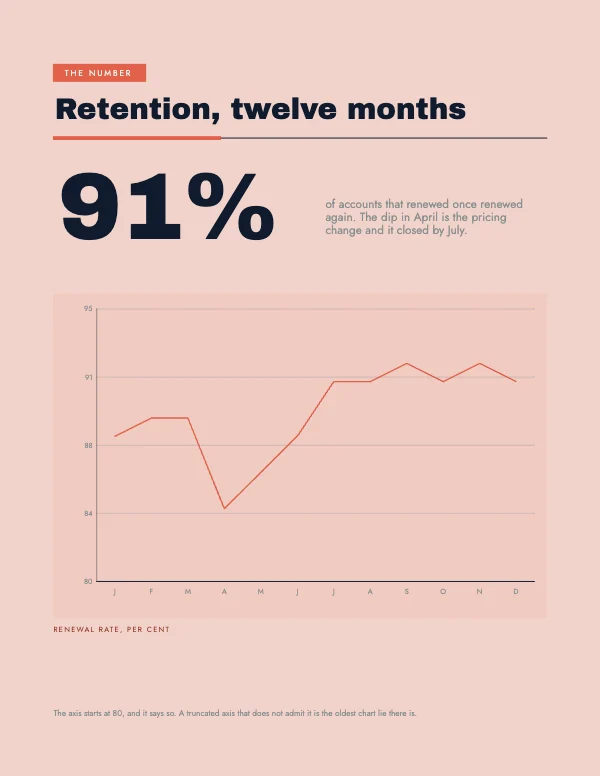 Headline Figure BlockPro
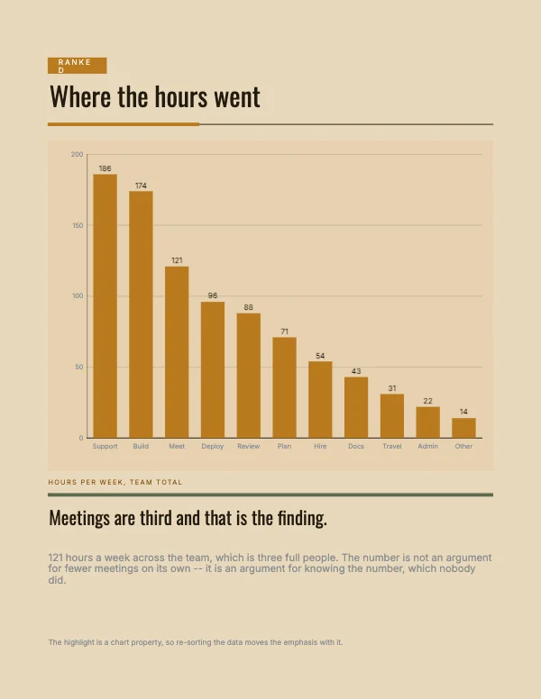 Ranked Bar Chart BlockPro
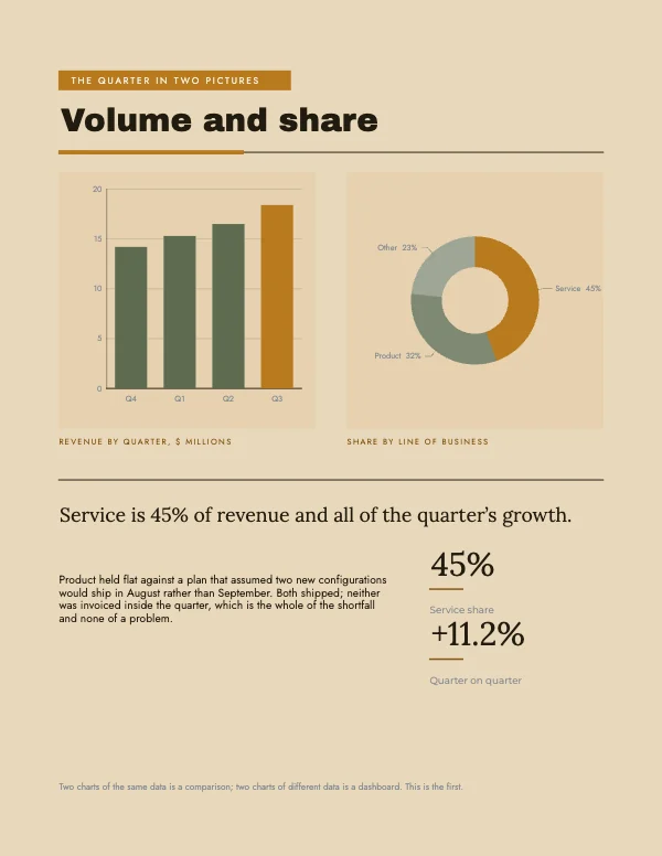 Two Chart Summary BlockPro
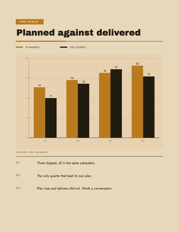 Two Series Chart BlockPro
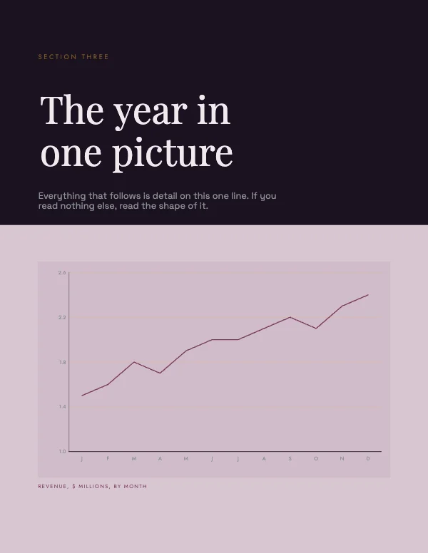 Chart Cover Page BlockPro
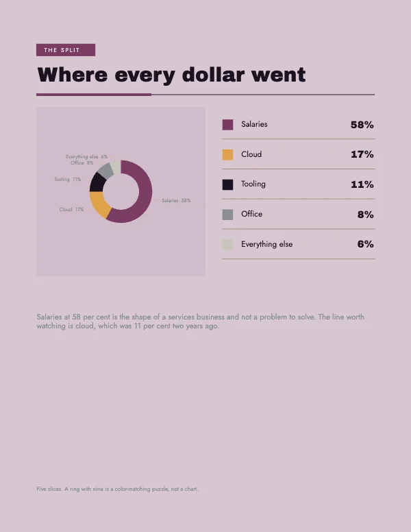 Donut and Legend BlockPro
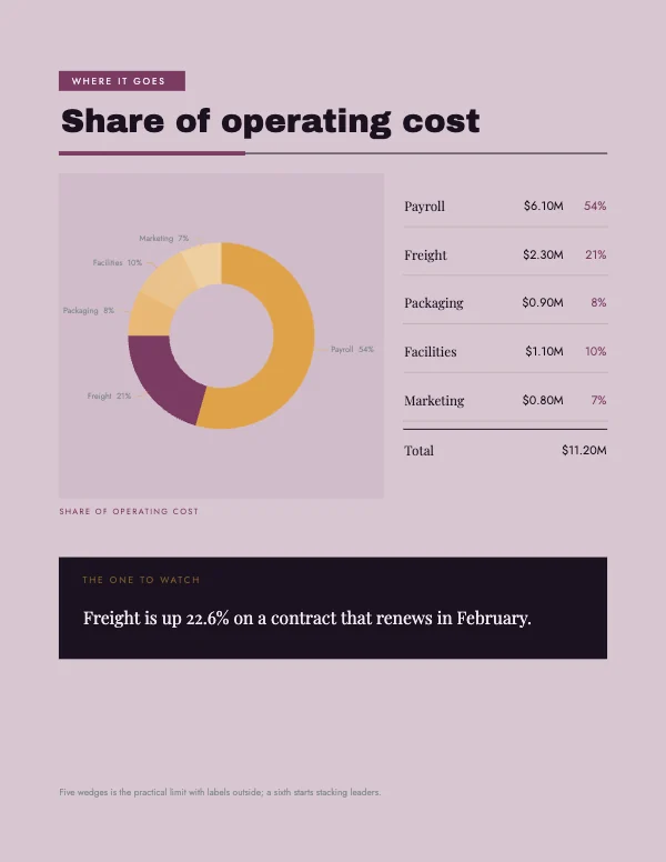 Share Donut Chart BlockPro
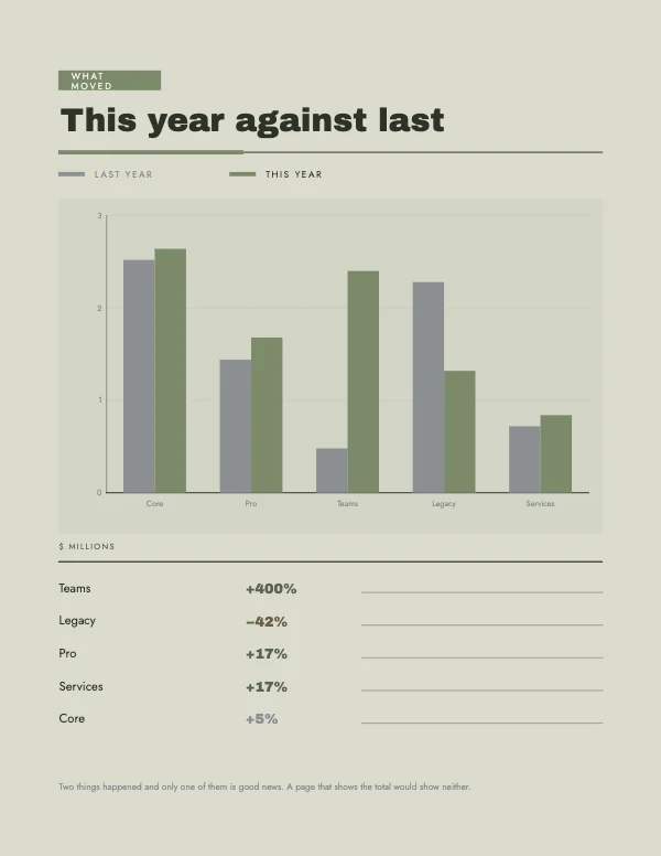 Change Since Last Year BlockPro
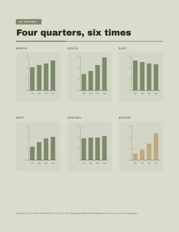 Six Small Multiples BlockPro
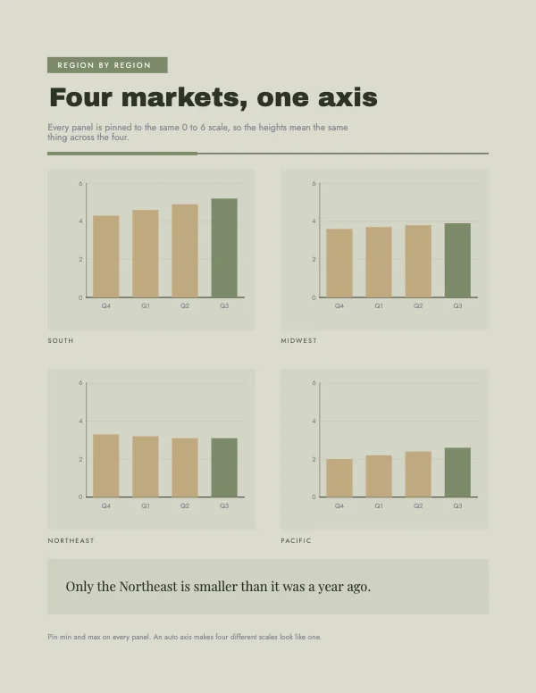 Small Multiples Chart BlockPro
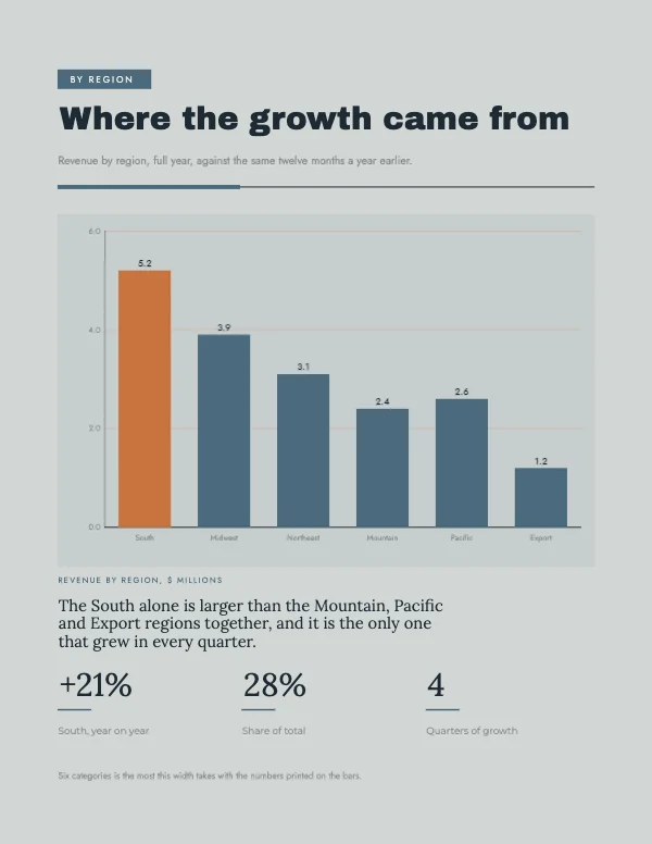 Bar Chart Comparison Block
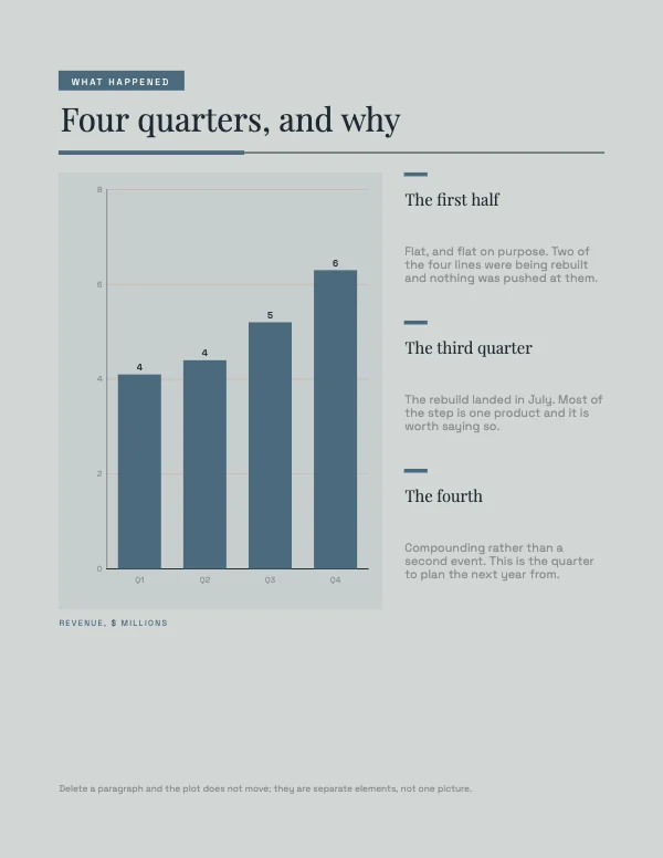 Chart and Narrative BlockPro
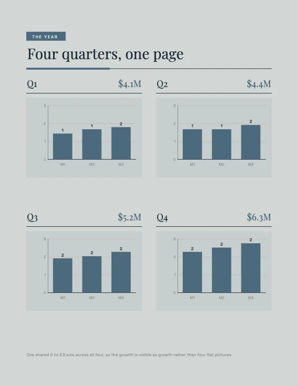 Four Quarters Grid BlockPro
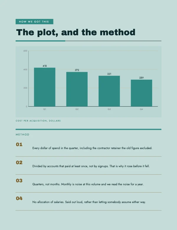 Chart with Method BlockPro
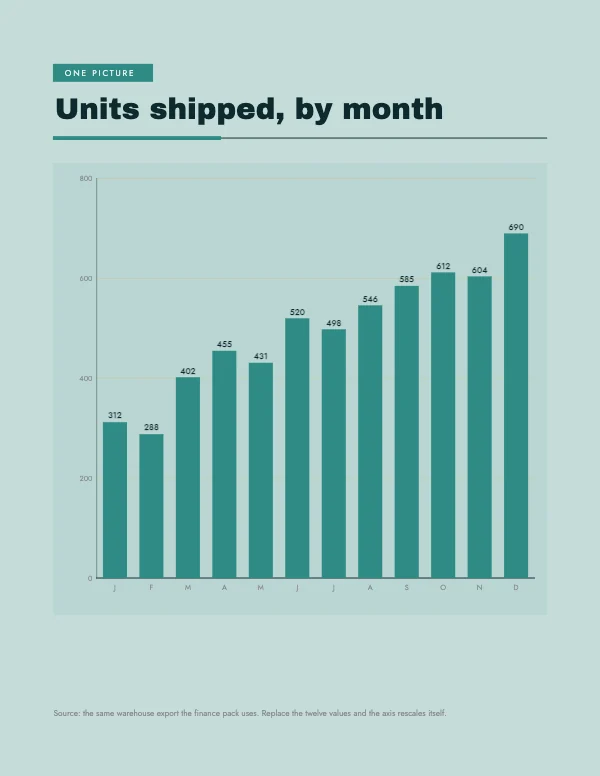 Full Page Chart BlockPro
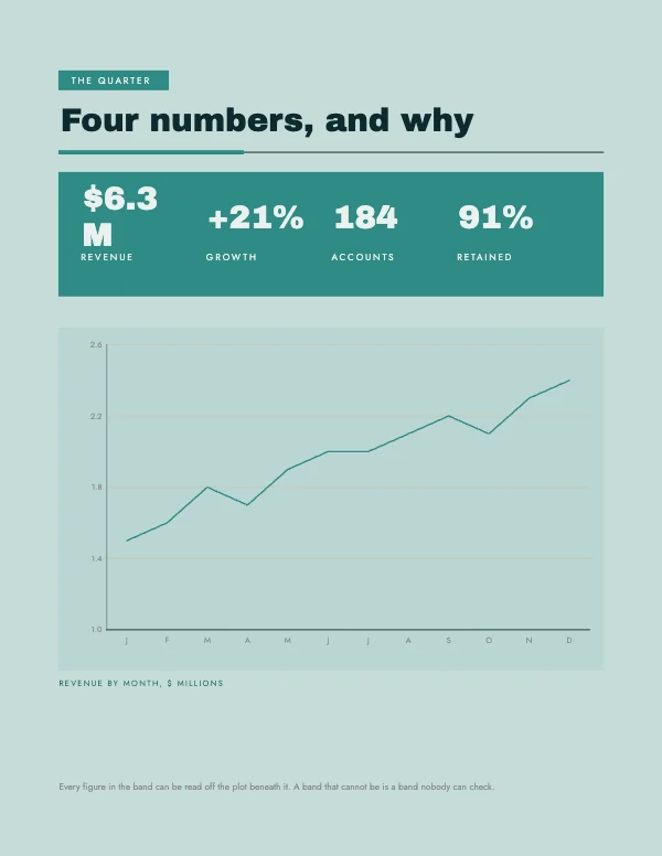 KPI Band Over Chart BlockPro
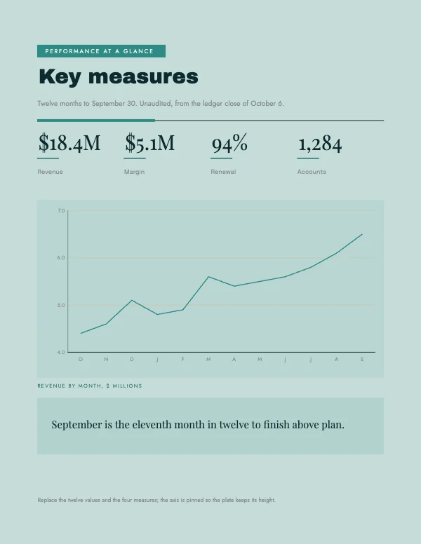 KPI Band Report Block
These are pages, not posters
Most infographic templates are one very tall image meant to be scrolled. These are not. Each one is a letter page that drops into a document you are already writing — a report, a proposal, a board pack, a one-pager — and prints as part of it.
That is a different design problem and it has different rules. A page has to survive being printed in black and white by somebody in a hurry; it has to sit next to a page of body text without shouting; and it has to be readable in the hand rather than at arm's length. Everything on this page follows from those three.
If you actually want the tall scrolling kind, it is a poster, and the poster templates are the right starting point — set the document height to whatever you need in Page Setup.
The charts are real charts
The bar, line, pie and donut blocks are generated from numbers, not drawn as shapes. Change the values and the chart redraws — the bars re-scale, the axis re-labels, the donut re-segments. That matters for two reasons that only show up later: the numbers stay editable when a figure changes the day before the meeting, and the chart renders at the document's own resolution rather than being a screenshot pasted at 96 DPI.
A pasted screenshot of a chart is the single most common reason a good report prints badly. On screen it is fine. On paper it is a 96 DPI image being printed at 300, which means every label is soft while the type around it is sharp — and the contrast between the two is what makes it obvious.
Choosing the right block for the number you have
Most of the damage in a business document is done by using the wrong shape for the data, and it is usually one of four mistakes.
- A pie chart with more than about five slices is unreadable. The eye cannot compare angles well, and past five slices it cannot even find them. Use a bar chart; it is less decorative and it is legible.
- A bar chart with a truncated axis exaggerates. Starting the axis at 80 instead of 0 turns a 4% difference into a cliff. Sometimes that is genuinely the right call for a zoomed view — but label it, because a reader who spots it will discount everything else on the page.
- A line chart for categories that have no order is meaningless. Lines imply progression. Departments, products and regions do not progress into each other; they are bars.
- A table where a chart was needed, or a chart where a table was needed. If the reader will want the exact figure, give them the table. If they want the shape, give them the chart. If they want both, the table-and-chart block exists for exactly that.
Print it in black and white before you send it
This is the check almost nobody runs and it catches almost everything.
A large proportion of any printed business document is printed on a black-and-white office machine by somebody who does not think about it. If your chart distinguishes its series by color alone — teal against gold, coral against navy — those series become two nearly identical grays, and the page becomes decorative.
The fix is cheap. Distinguish by value (light versus dark), by pattern, or by direct labeling — putting the name at the end of the line rather than in a legend that has to be matched back by color. Direct labeling is better than a legend even in full color, because it removes a lookup the reader has to perform.
Margins and gutters, if these are going into a bound document
The blocks are laid out with 0.5 inch margins, which is right for a stapled or clipped document. If the report is being bound — spiral, comb, perfect-bound — the binding edge needs more, because part of it disappears into the fold or is punched through.
As a working number: 0.75 inch on the binding edge, and remember it swaps sides on facing pages if the document is printed double-sided. A comb or spiral punch needs a clear half inch of nothing at all, so no rule, no color band and no page number in that strip.
Bleed, and when a document does not need it
Most of these do not need bleed and are better without it. A report page with a white margin is a normal document; a report page with a color field running off all four edges is expensive to print, impossible to produce on an office machine, and does not read as more serious.
Where bleed does earn its place is a section divider or a cover page — one page with a full color field, printed at a shop, in an otherwise plain document. That contrast is worth the setup. Turn bleed on for those pages only, and export them separately if the rest is going through the office printer.
Questions
What size should an infographic be?
If it is going into a document or being printed, 8.5 × 11 at 300 DPI — which is what every template here is. If it is going on a web page to be scrolled, it is a tall image and there is no standard size; start from a poster document and set the height you want.
Can I edit the numbers in the charts?
Yes. The bar, line, pie and donut blocks are drawn from values you can change, not from an image of a chart. Edit the numbers and the chart redraws at the document's own resolution.
Why does my chart look blurry when I print it?
Almost always because it is a screenshot. A screen grab is around 96 DPI and is being printed at 300, so it is soft next to the sharp type around it. Use a chart block that renders at the document's resolution instead of pasting a picture of one.
Which chart should I use?
Bars for comparing categories, lines for change over time, pie or donut only for a small number of parts of one whole — five slices at the very most. If the reader needs the exact figure, use a table; if they need the shape, use a chart.
Will these print in black and white?
They will print, but check them first. Series distinguished only by color turn into similar grays. Distinguish by light and dark, by pattern, or by labeling the series directly instead of using a legend — that is better practice in color too.
What margins should a report page have?
Half an inch is right for a stapled document, which is what these use. If it is being bound or punched, give the binding edge three quarters of an inch and keep that strip completely clear — and remember it swaps sides on double-sided pages.
Do these need bleed?
Mostly no. A white margin is what a document is supposed to look like, and full-bleed color pages cannot be produced on an office printer. Use bleed for a section divider or a cover page that is being printed properly, and leave it off for the body.
Can I put these into a document I already have?
Yes — export the page as a PDF or an image at full size and drop it in. Because they are letter sized at 300 DPI they land at the right scale rather than needing to be resized, which is what usually softens an imported page.
Can I use these at work?
Yes, including commercially, on the free plan, with no watermark, no royalty and no credit. That covers client work and anything internal.
Where to go next
Put together an occasion
Every category
How printing works
Open any of these and it is already the right size. Bleed, margins and trim are set, and there is no watermark on anything you export — on any plan, ever.