
Crevano · Templates · Magazine Cover Templates
Magazine Cover Templates
15 editorial covers at 8.5 × 11 with real bleed, where the masthead, every cover line and the issue slug is a separate element you can retype rather than a picture of a cover. 300 DPI, 0.125 inch of bleed, and the safe area drawn where a saddle-stitched magazine actually needs it.
| Trim size | 8.5 × 11 in |
|---|---|
| Bleed | none · 0.125 in |
| Resolution target | 300 DPI |
| Templates | 15 |
| Pages | 15 |
No templates match that.
Magazine cover templates (15)
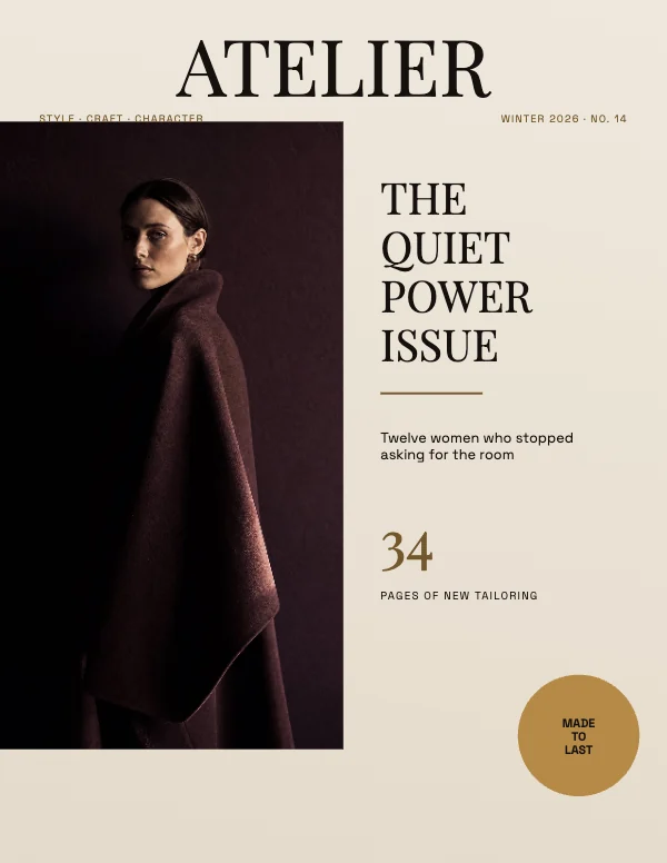 Bold Fashion Magazine CoverPro
 Modernist Architecture Magazine Cover
 Soft Wellness Magazine CoverPro
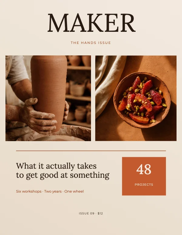 Warm Craft Magazine Cover
 Linen and Stone Minimalist Full-Bleed Wellness Magazine CoverPro
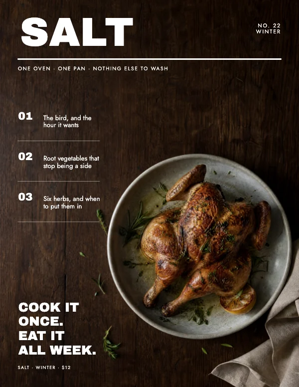 Oak and White Modernist Full-Bleed Food Magazine CoverPro
 Vibrant Food Magazine Cover
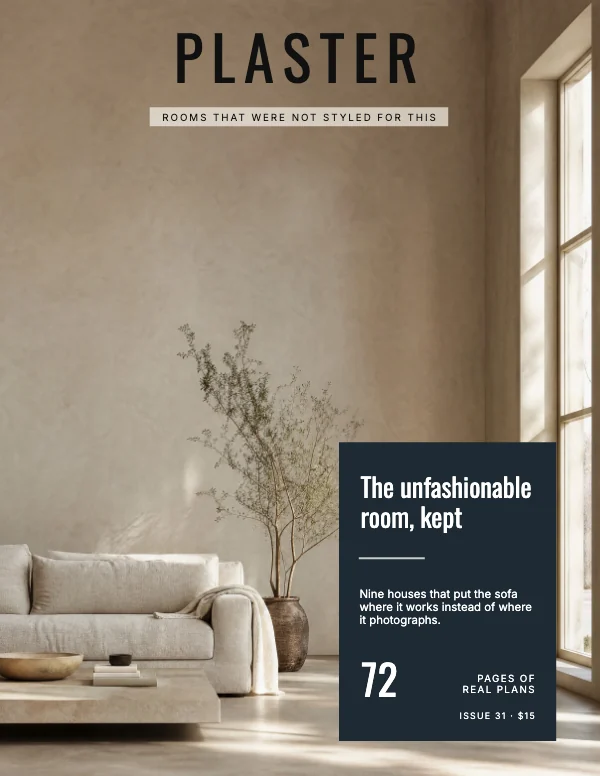 Plaster and Slate Broadsheet Full-Bleed Interiors Magazine CoverPro
 Minimalist Botanical Magazine Cover
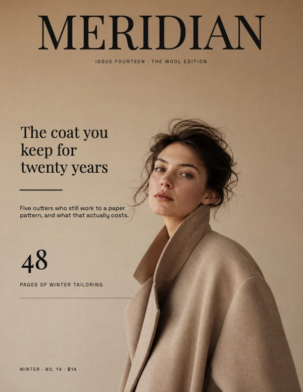 Sand and Ink Editorial Full-Bleed Fashion Magazine CoverPro
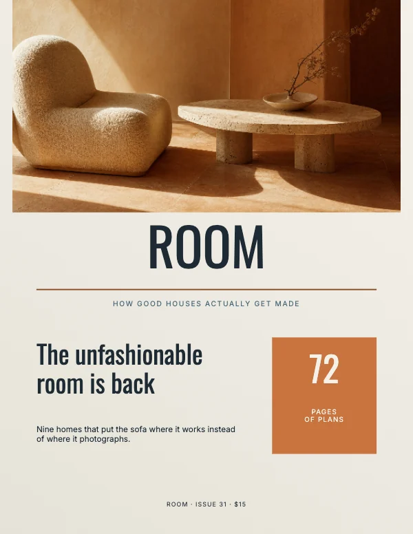 Modern Interiors Magazine CoverPro
 Editorial Travel Magazine CoverPro
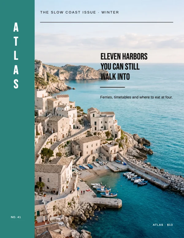 Teal and Limestone Spine Full-Bleed Travel Magazine CoverPro
 Workshop and Clay Profile Full-Bleed Business Magazine CoverPro
 Travel Magazine CoverPro
Why they are all 8.5 × 11
Because that is the North American magazine trim and the sheet a print shop already prices. A saddle-stitched or perfect-bound magazine at 8.5 × 11 costs less per copy than any other size, because it is what the presses and the folders are set up for. Overseas the equivalent is A4, which is 8.27 × 11.69 — close enough that a design moves between them, and different enough that you have to actually change the document rather than assume.
If you are making a cover for a mock-up, a portfolio piece, a school project or a print-on-demand zine, 8.5 × 11 is the right answer and there is no second question.
What a cover has to do, in order
A magazine cover is one of the few designs with a genuinely fixed job list, and the order matters more than the aesthetics.
- Be identifiable at thumbnail size. On a shelf it is two inches of visible spine and top corner; online it is 150 pixels tall. The masthead and the dominant image do all the work.
- Name the one story somebody buys it for. The lead cover line is the sale. Everything else on the cover is evidence that the magazine is worth the money, not a second attempt at the sale.
- Say what kind of thing it is. A food cover and an architecture cover are recognizable from across a room before a single word is read, and that is type and color, not content.
- Carry the housekeeping. Issue, date, price, barcode if it is going on a shelf.
The templates lay all four out. What they cannot do is choose your lead line, and that is the decision that makes or loses the cover.
The masthead, and the part people get wrong
The masthead is not a logo dropped on top. Two conventions are worth keeping because they are doing real work:
- It sits at the top, and it is allowed to be covered. A confident magazine lets the subject's head overlap the bottom of the masthead, because the reader completes the word from memory. A first issue cannot do this — nobody has the memory yet — so on anything new, keep it intact.
- It bleeds off the sides more often than not. Letting the word run to the trim on both sides makes a cover feel larger than it is. That only works if there is actual bleed behind it, which is why the templates carry it.
The one hard constraint: the top 2 inches must survive being hidden. On a rack, magazines overlap and only the top strip of each shows. Anything critical below that strip is invisible in a retail context. That is why the masthead and the lead line live where they do.
Trim, bleed and the edges
0.125 inch of bleed on all four sides. A cover almost always has a photograph or a color field reaching at least one edge, so this is not optional here the way it is on letterhead.
Keep type 0.25 inch inside the trim, and treat the binding edge as a special case. On a saddle-stitched magazine the fold takes a little; on a perfect-bound one the spine takes more and the outer few millimeters of the front cover curve away from the reader. Give the left edge of the front cover a little more room than the right — a cover line that ends 0.2 inch from the spine reads as crowded even when it technically fits.
The barcode, if it is going on a shelf
Retail magazines carry a barcode, usually bottom left on the front cover, in a reserved area of about 1.5 × 1 inch with a quarter inch of clearance around it. It has to sit on a light, flat area — a scanner needs contrast, and a barcode printed over a busy photograph fails at the till.
If the magazine is not going into retail, you do not need one, and a cover is cleaner without it. Do not add a decorative barcode; it is the kind of detail that makes a portfolio piece look like a mock-up.
The thumbnail test, which is the only test that matters early
Shrink the cover until it is about an inch and a half tall and look at it. That is the size it is decided at, in a shelf photograph, in a search result, in an app.
At that size, three things are visible and nothing else is: the masthead, the shape of the main image, and the largest cover line. If the largest cover line is not legible, it is not a cover line — it is texture, and it should either get much bigger or come off. Most first drafts have four lines competing at the same weight, which reads at thumbnail size as a gray smudge.
Photographs on a cover
A cover photograph is being printed at 8.5 × 11 inches. At 300 DPI that is 2,550 × 3,300 pixels, and the whole picture has to clear it — not the part you are showing, the part you are showing after you crop. Cropping into a photograph is exactly what raises the required resolution, and it is the step people forget when they check.
Crevano reads the file's real dimensions and shows the effective number at the size on the page, naming the axis that ran out. On a full-bleed cover the axis is usually the short one, which is usually not the one being watched.
Faces want room. A subject cropped tight to the trim on a cover with bleed loses a few millimeters of forehead or chin on some copies, and that is the single most noticeable trimming error there is.
Questions
What size is a magazine cover?
8.5 × 11 inches in North America, plus 0.125 inch of bleed on each side. A4 (8.27 × 11.69 in) is the international equivalent. Both are portrait, and both assume the cover is one page of a document, not a standalone image.
How much bleed does a magazine cover need?
0.125 inch on all four sides. Covers almost always have color or a photograph reaching an edge, so this is not the case where you can skip it. Keep type at least 0.25 inch inside the trim.
Where does the masthead go?
Top of the cover, and it is allowed to bleed off the left and right edges. Keep the top 2 inches readable on its own — that is the strip that shows when magazines overlap on a rack. A new title should not let anything overlap the masthead until readers know the word.
Where does the barcode go on a magazine?
Usually bottom left of the front cover, in about 1.5 × 1 inch of flat, light space with a quarter inch of clearance. Only add one if the magazine is going into retail; otherwise leave it off.
How many cover lines should a cover have?
One that sells it and two or three that support it, at clearly different sizes. Four lines at the same weight is the most common first-draft mistake and it reads as a gray block at the size the cover is actually judged.
Can I print a magazine cover at home?
You can print the cover as a single 8.5 × 11 sheet, without bleed, and it will look like a page rather than a cover — a home printer cannot reach the edge. For anything that should look like a magazine, send it out; a cover is the one page where the edge is the whole effect.
What resolution does a cover photo need?
2,550 × 3,300 pixels for a full-bleed 8.5 × 11 at 300 DPI, measured after you crop. Check the number the app shows at the size on the page rather than the megapixels of the original.
Can I use these for a real publication?
Yes, including commercially, on the free plan — no royalty, no credit, no expiry. Check your printer's own specification for bleed and safe area before you send, because binding methods differ and the binding edge is where they differ most.
What file does the printer want?
A PDF at 8.5 × 11 trim with bleed included, and the trim size stated. Crevano writes each page as a lossless 300 DPI image inside the PDF. If they ask for crop marks or a vector file, ask before you send.
Where to go next
Put together an occasion
Every category
How printing works
Open any of these and it is already the right size. Bleed, margins and trim are set, and there is no watermark on anything you export — on any plan, ever.