
Crevano · Templates · Yard Sign Templates
Yard Sign Templates
7 yard signs at 18 × 24 and 24 × 18 inches — the two trims every coroplast printer cuts — built at 150 DPI at final size with 0.125 inch of bleed. Every headline on every sign is sized from a stated viewing distance in feet, using the sign trade's rule rather than a poster's, and the build refuses any line that does not reach the size that distance needs.
| Trim sizes | 18 × 24 in · 24 × 18 in |
|---|---|
| Bleed | 0.125 in |
| Resolution target | 150 DPI |
| Templates | 7 |
| Pages | 7 |
No templates match that.
Yard sign templates (7)
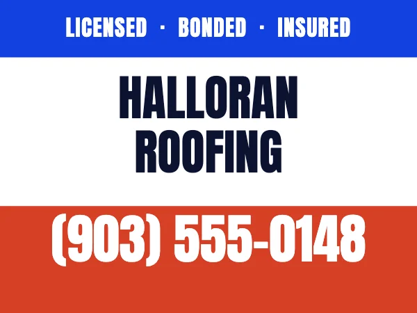 Contractor Yard Sign
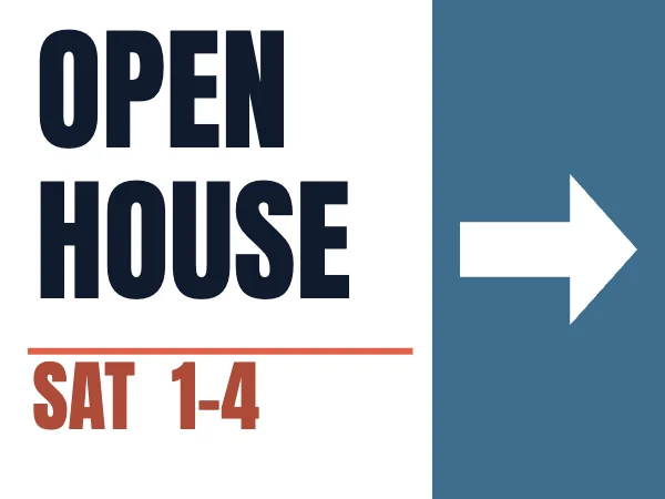 Open House Yard SignPro
 Now Hiring Yard SignPro
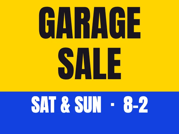 Garage Sale Yard Sign
 Gym Yard SignPro
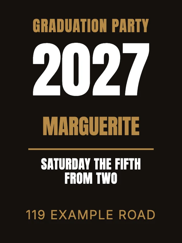 Graduation Party Sign
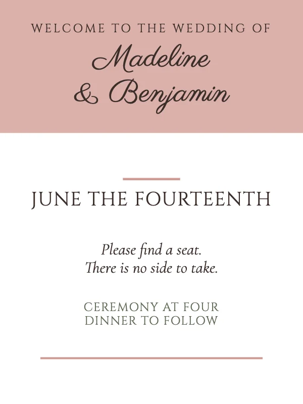 Wedding Welcome Sign
The rule that decides everything on a yard sign
One inch of capital-letter height for every ten feet of viewing distance. Sign makers have used this for decades and it is the only number on this page that matters, because it decides how many words fit — which decides the design.
Two things about it are worth getting right, and most template libraries get both wrong.
It measures the CAP, not the point size. Those are different quantities. Type set at 72 point is one inch of em, and the capital letters inside that em are only 0.62 to 0.86 inches tall depending on the typeface. So "72 point at ten feet" — which is genuinely good advice for a conference poster read indoors, standing still — delivers between 14% and 38% less letter than a sign needs outdoors at a glance. Every headline here is set from cap height and measured off the font file, not converted from a point size.
And it makes the typeface a structural decision rather than a stylistic one. Measured at 4.2 inches of cap — 35 feet with the moving-traffic allowance — the word HOUSE sets 11.4 inches wide in Anton and 24.0 inches wide in Archivo Black. Same legibility, same letter height, and one of them does not fit on a 24-inch sign at all. On a sheet you read at arm's length the condensed face is a preference. Here it is what makes the required size fit the substrate.
The trade also adds 20 to 30 percent for a sign beside traffic moving faster than about 35 mph. The signs here that are read from a car use the low end of that, because a residential street is a car doing 25.
Why a yard sign holds three words
Work the rule backwards and the answer falls out. A directional open-house sign is read from about 35 feet from a moving car, which needs 4.2 inches of cap. On a 24-inch sign with an arrow taking a third of the sheet, that leaves room for OPEN HOUSE and a time. Not an address, not a phone number, not a photograph of the agent.
This is the single most common mistake on a real yard sign, and it is not a taste failure — it is an arithmetic one. Our own first draft of the contractor sign carried a row of three services set at 64 point. That is 0.76 inches of cap, readable from seven and a half feet, on a sign staked twenty-six feet from the road. They were not small. They were invisible, and they passed every automated check we have, because a text box is a text box whatever size the type inside it is.
They are not on the sign now. What replaced them is nothing.
The bottom inch and a half is grass
A lawn sign is not a sheet of paper. It stands in a yard on an H-stake, and the bottom of it is behind grass, mulch or a flower bed for the whole time it is up.
So nothing that has to be read goes in the bottom 1.5 inches of any staked sign here, and the type in a foot-of-the-sign color chip is centered in the part you can still see rather than in the shape itself — which looks slightly high on screen and correct on the lawn. This is our design reserve, not a printer's specification; do not quote it to your printer as one.
The exception is the wedding welcome sign, which stands on an easel at a door. Nothing is in front of it, so it uses the full sheet — and it is read from about eight feet standing still rather than from a car, which is why its type is set at 0.8 inches of cap where the open-house sign needs 4.2. Same substrate, a fifth of the size. The distance is a property of the sign, never of the section.
Flutes, stakes and the one thing to tell your printer
Corrugated plastic has hollow channels running through it — flutes, about 3/16 inch wide. An H-stake slides into those flutes, which means it only works if they run vertically, through the height of the finished sign.
That is a print-order option and not something in the artwork, so it is the one instruction to carry over: order vertical flutes, whichever of the two trims you choose. It is easy to miss on a landscape 24 × 18, where the default is not always what you want, and a sign with horizontal flutes cannot be staked at all.
Bleed is 0.125 inch. Printers publish both 1/8 and 1/16 inch; 1/8 is the figure every one of them accepts, and an over-bleed is trimmed away while an under-bleed is a white edge nobody can fix after the fact.
Why these are not in the banner section
They are a different product and, more usefully, a different search.
The word "banner" has gone digital. Type banner template into a search box today and the completions are YouTube, LinkedIn, website and shop — every one of them a screen graphic. Our 48 × 24 vinyl banners are a real physical product, and somebody looking for a sign to put in a yard will never reach them through that word.
They are also genuinely different objects: vinyl versus 4 mm corrugated plastic, hems and grommets versus a wire stake, four feet by two versus eighteen by twenty-four. A section needs a distinct trim or production method rather than a distinct name, and this has both.
Questions
What size yard sign should I get?
18 × 24 or 24 × 18 — they are the same sheet turned, and both are stock sizes at every coroplast printer. Choose by what the sign has to say rather than by where it goes: a headline of one long word or two short ones wants the landscape 24 × 18, because the extra six inches of width is what lets the letters stay big. Anything built around a vertical stack — a name under a year, a couple's names under a welcome — wants the portrait 18 × 24.
Do I need bleed on a yard sign?
Yes, if any color runs to the edge, which on a flooded sign is all four edges. 0.125 inch on every side. If your design sits on a white ground with a margin all around, you do not need it, and one of the signs here is built that way on purpose.
Can I print these at home?
No, and nothing at this size can be. These are files for a coroplast printer — the substrate is plastic sheet, the press is large-format, and the finishing is a die cut. What you can do at home is proof one on letter paper to check the wording and the balance before you spend anything.
Should the sign be a solid color or white?
Solid, usually. A lawn sign is printed edge to edge and a white one with a small colored element is not a thing anybody stakes — the flood is what makes it visible against a lawn, a fence and a house all at once. The exceptions here are deliberate: real-estate signage is white and navy by convention, and a sign carrying three separate facts rather than one is easier to read on white than reversed out of a flood.
How many colors should a yard sign use?
Two, plus whatever the type is set in. Every sign in this section uses one field color and one chip color, and the contrast between them is what does the work at thirty feet. Color conventions are worth obeying rather than beating: garage sale signs are yellow, and departing from that costs recognition before your design has earned any.
Where to go next
Open any of these and it is already the right size. Bleed, margins and trim are set, and there is no watermark on anything you export — on any plan, ever.