
Crevano · Templates · Business Card Templates
Business Card Templates
3.5 × 2 inches — the US business card, and the size every printer in the country quotes without being asked. 12 templates at that trim, at 300 DPI, nearly all with 0.125 inch of bleed, and the safe area drawn where it needs to be on something this small.
| Trim size | 3.5 × 2 in |
|---|---|
| Bleed | none · 0.125 in |
| Resolution target | 300 DPI |
| Templates | 12 |
| Pages | 14 |
No templates match that.
Business card templates (12)
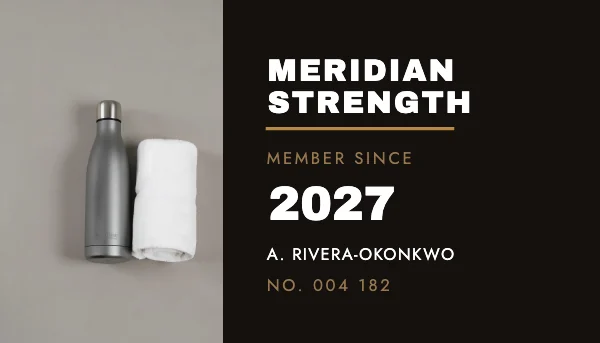 Gym Membership CardPro
 Minimalist Business Card
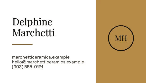 Minimalist Business Card (Back)
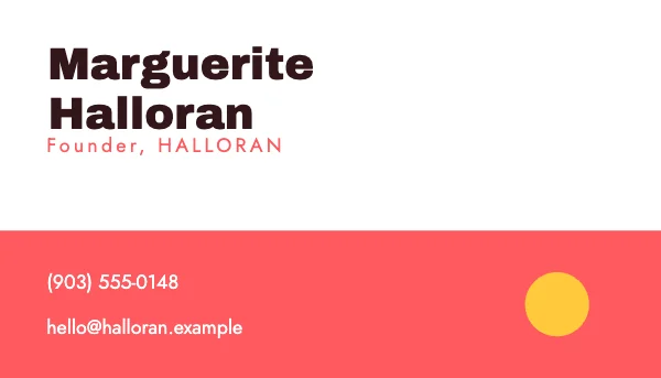 Footer Panel Business CardPro
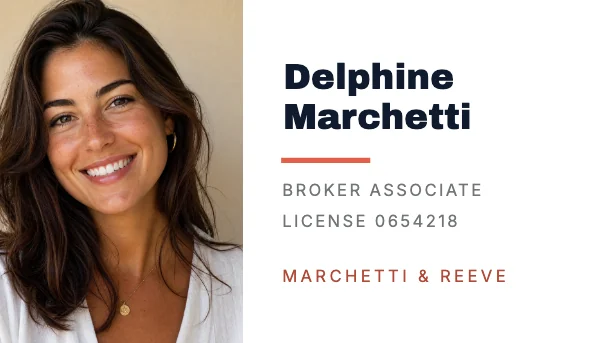 Real Estate Agent Business CardPro
 Top Bar Business CardPro
 Dot Pattern Business CardPro
 Monogram Disc Business CardPro
 Bordered Frame Business CardPro
 Diagonal Cut Business Card
 Left Band Business Card
 Split Half Business CardPro
The numbers on a card this small
| Trim | 3.5 × 2 in (US). 85 × 55 mm in Europe, 91 × 55 mm in Japan |
|---|---|
| With bleed | 3.75 × 2.25 in |
| File at 300 DPI | 1,125 × 675 px with bleed |
| Safe area | 0.125 in inside the trim, and 0.1875 in is safer |
| Rounded corners | a 0.125 in radius removes a visible amount of a corner — measure from the safe area |
A business card is the least forgiving thing on this site, because the trim error is the same absolute size as it is on a poster and the card is one twentieth of the area. An eighth of an inch off a 24 × 36 is invisible; an eighth of an inch off a 3.5 × 2 is 6% of the height.
So: no thin borders, and no type parallel to an edge and close to it. A rule set a sixteenth of an inch from the trim will be a different distance on every card in the box. Either bleed the color right off, or leave a generous margin.
What actually goes on it
The card has one job: let somebody contact you later. Everything else is competing with that.
Name. What you do. One way to reach you. That is the core, and cards that carry it well look confident. A card carrying a phone, a mobile, two emails, a website, three social handles, an address and a QR code looks like a form.
Two specifics worth stating:
- Type below 7 point is decoration. It is not read, and on an uncoated stock it fills in. 8 point is a sensible floor for anything anybody has to actually use.
- A QR code needs quiet space and contrast. At least a quarter inch square to scan reliably at arm's length, with a clear margin around it and real contrast — a light gray code on a white card does not scan under a restaurant's lighting.
The back is not free space
A blank back is a deliberate, expensive-looking choice, and it is also a useful one: people write on the back of business cards — where they met you, what you talked about. An uncoated or matte back takes a pen; a gloss back does not, and a card that cannot be written on loses the note that would have got you the call.
If you do print the back, print one thing on it. A tagline, a map, an offer, a second language. Two things on a back is the same crowding problem as the front, in a place nobody is looking.
Stock, and where the money actually shows
The design is about a third of what a card communicates; the stock is most of the rest.
Weight is the first thing a hand registers. 14 pt is a normal card. 16 pt reads as substantial. 32 pt is a statement and costs accordingly. Below about 12 pt a card feels like a ticket.
Finish changes the design more than people expect. Uncoated is warm, takes ink into the fiber so blacks are slightly softer, and takes a pen. Matte is clean and modern. Gloss holds photographs and saturation and shows every fingerprint. Soft-touch feels expensive and scuffs.
If the card is being printed in quantity, ask for a sample of the stock before the run. A color proof on the wrong paper tells you almost nothing.
Questions
What size is a business card?
3.5 × 2 inches in the US and Canada. Europe uses 85 × 55 mm and Japan uses 91 × 55 mm, so if the cards are going abroad, ask — a US card is noticeably shorter than a European one and does not sit right in a European card holder.
How much bleed does a business card need?
0.125 inch on each side, giving a 3.75 × 2.25 inch file. Keep type at least 0.125 inch inside the trim, and 0.1875 is safer — the trim error is the same size as on a poster but the card is a twentieth of the area.
What resolution should a business card be?
300 DPI, which is 1,125 × 675 pixels with bleed. A card is read at a few inches, so it is the least forgiving size for a soft logo or a small photograph.
Can I print business cards at home?
You can, on perforated card stock, and it will look like it. The perforated edge is visible and slightly furred, home printers cannot bleed, and the stock is thin. For anything you hand to a client, a short professional run costs less than the paper you would waste.
What should be on a business card?
Your name, what you do, and one reliable way to reach you. Everything beyond that competes with it. Nothing below about 8 point, because smaller type is not read and fills in on uncoated stock.
Should I print the back?
Only if you have one thing to put there. A blank uncoated back is genuinely useful, because people write on cards — where they met you, what you discussed — and a gloss back will not take a pen.
What card stock should I choose?
14 pt is standard, 16 pt reads as substantial, and below about 12 pt feels like a ticket. Uncoated takes a pen and reads warm; gloss holds photographs and shows fingerprints. Ask for a physical sample before a large run.
Will a QR code on a business card work?
If it is at least a quarter inch square, has clear space around it, and has real contrast. A light-gray code on white will not scan in a dim room, which is where business cards are usually exchanged.
Can I use these commercially?
Yes — free plan included, no watermark, no royalty, no credit, and the permission does not expire. That covers your own cards and cards you design for clients.
Where to go next
Put together an occasion
Every category
How printing works
Open any of these and it is already the right size. Bleed, margins and trim are set, and there is no watermark on anything you export — on any plan, ever.