
Crevano · Templates · Real Estate Templates
Real Estate Templates
14 templates for listing a property and for the work around it — everything from the sheet in the flyer box to the sign in the yard, including the listing flyer, the open house flyer, the property brochure, the just listed postcard and the agent's own card. All at 300 DPI, all editable in the browser, and all yours to use commercially, including for client work.
| Trim sizes | 24 × 18 in · 8.5 × 11 in · 11 × 8.5 in · 6 × 4 in · 3.5 × 2 in |
|---|---|
| Bleed | none · 0.125 in |
| Resolution target | 150 DPI · 300 DPI |
| Templates | 14 |
| Pages | 33 |
No templates match that.
Real estate templates (14)
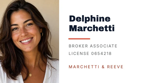 Real Estate Agent Business CardPro
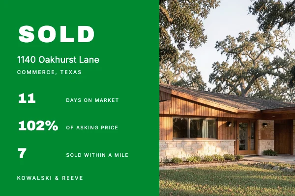 Real Estate Just Sold PostcardPro
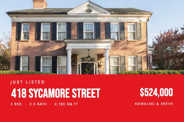 Real Estate Just Listed Postcard
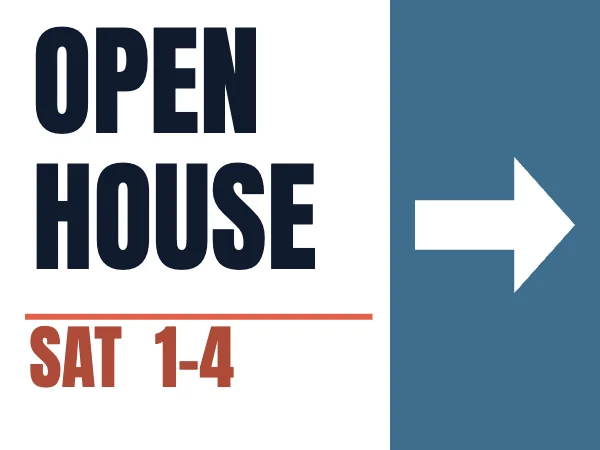 Open House Yard SignPro
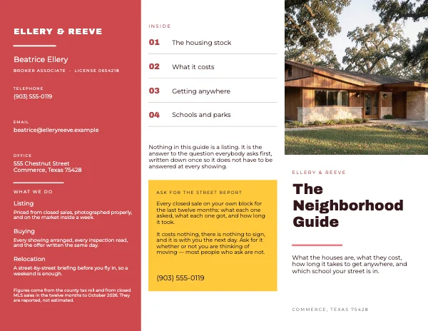 Real Estate Neighborhood Guide Tri-FoldPro
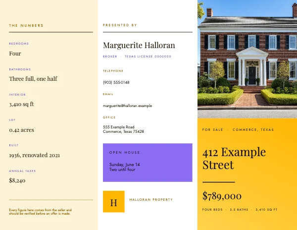 Editorial Tri-Fold Real Estate Listing Brochure
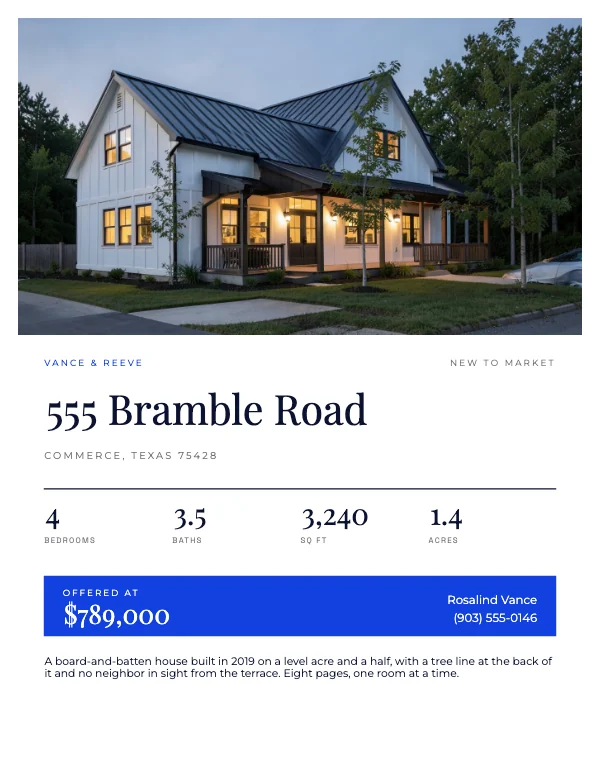 Real Estate Property Listing BookPro
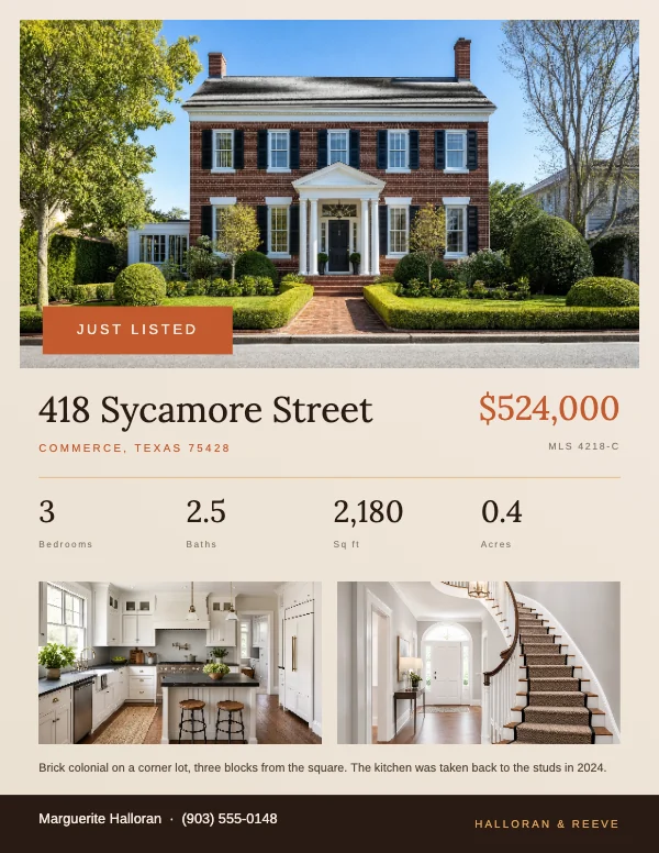 Warm Real Estate Listing FlyerPro
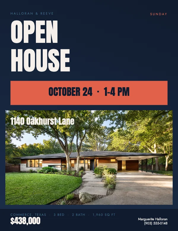 Bold Real Estate Open House Flyer
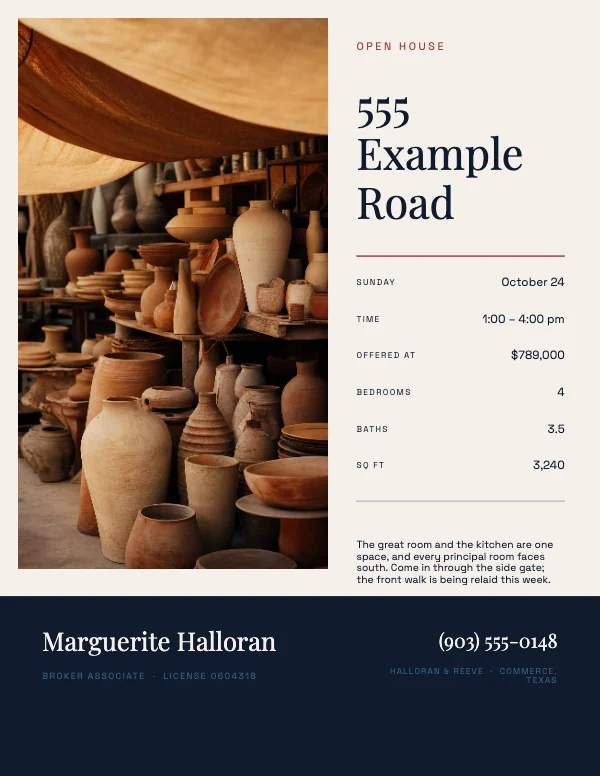 Modern Open House FlyerPro
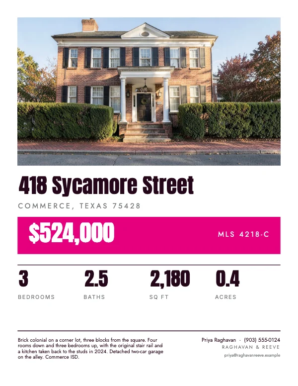 Real Estate Window CardPro
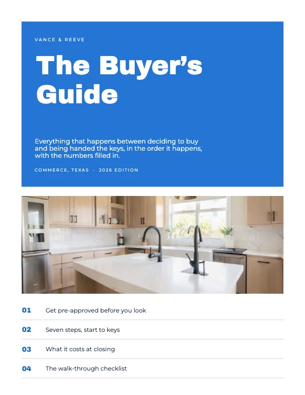 Real Estate Buyer’s GuidePro
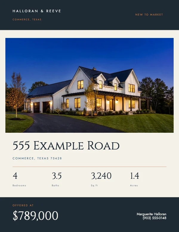 Modern Real Estate Property BrochurePro
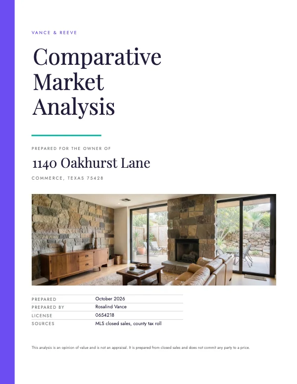 Real Estate Comparative Market AnalysisPro
The three jobs, and they want different paper
A real estate library gets used at three separate moments, and almost every complaint about a piece is really a complaint about it being used at the wrong one.
Winning the listing. Before there is a property to advertise there is a seller to persuade, and that is a multi-page job: a comparative market analysis, a listing presentation, a buyer's guide you hand to somebody at the start of a relationship rather than at the end of a viewing. These are read sitting down, one to one, and they are the only pieces here where a lot of text is correct.
Selling the house. The flyer in the box, the flyer on the counter, the brochure for the listing that justifies one, the window card in the office glass. Read standing up, in under ten seconds, usually while the reader is holding something else.
Being findable next time. The just listed and just sold postcards, the yard sign, the agent card. None of them is about the house — they are about the reader remembering who sold it. They carry the least information and are seen the most times.
Sort a piece into one of those groups before choosing a template, because the hierarchy follows from it. On a listing piece the photograph leads. On a farming piece the name leads. In a listing presentation neither leads — the argument does.
Where these live, and why they are collected here
They sit in different parts of the library because they are different products: the flyers under Flyers, the folded pieces under Brochures, the postcards under Invitations and Cards, the agent card under Business Cards, the sign under Yard Signs, and the multi-page presentation pieces under Business Documents.
An agent looking for "real estate templates" should not have to visit six category pages to find them, so this page collects them. Every template still lives in its own category and nothing here is a second copy of it.
The MLS photograph problem, and how to check it in one glance
Most real estate pieces are let down by their photographs, and it is almost never the photographer's fault — it is what happened to the file afterward.
An MLS export or a listing-site download is frequently 1024 or 1200 pixels on the long side. On a screen it looks perfect. Printed across the top half of an 8.5 × 11 flyer — say 8 inches wide — 1200 pixels is 150 DPI, which is visibly soft on paper. The listing photo you are proud of comes back looking like a photocopy, and the whole sheet looks cheap because of one image.
Crevano shows you the number, at the size you are actually using the picture, with the axis that ran out named underneath. Place the photograph, look at the badge, and if it says the image is too enlarged, go and get the original from the photographer rather than the copy from the portal. A full 8-inch-wide photograph at 300 DPI needs 2,400 pixels across; a 12-megapixel camera clears that several times over.
The short side is the one that fails, and on a wide hero crop it is usually not the one you were watching.
The number moves with the piece, and it moves a long way. The same photograph that is marginal across a flyer is comfortable on a postcard and beside the point on a yard sign. A sign is read from a moving car, so 100 DPI at final size is sharp — but 100 DPI across 24 inches is still 2,400 pixels, which is why the honest answer on large format is usually type rather than a photograph.
Fair housing wording is a design constraint, not a legal footnote
This is the part of a real estate piece that has actual consequences, and it belongs in a design brief rather than in a compliance memo, because most violations arrive through phrasing that sounded warm.
The Fair Housing Act prohibits statements that indicate a preference, limitation or discrimination based on race, color, religion, sex, disability, familial status or national origin. In listing copy, that principle bites hardest on descriptions of the people rather than the property.
The reliable rule is: describe the house, never the buyer. "Four bedrooms, fenced yard, quiet street" describes the house. "Perfect for a young family" describes the buyer, and it is the kind of phrase that draws a complaint. The same applies to "walking distance" (a mobility implication — "0.4 miles to the station" says the same thing better), to naming a place of worship as a selling point, and to any characterization of a neighborhood's residents.
Most brokerages have their own list and their own required disclosures — the equal housing logo, a license number, a brokerage name, sometimes specific disclaimer text — and those requirements vary by state and by firm. The templates leave a footer block for them. Use it, and get the wording from your broker rather than from a template, including ours.
This is general information about a common design constraint. It is not legal advice, and nothing on this page should be relied on as a compliance check — your brokerage's own rules and your state's requirements are the ones that govern.
Two logos and a headshot, and where they go
Real estate is one of the few categories where the piece carries three separate identities: the agent, the brokerage, and sometimes a team. All three usually have to appear, and the piece has to still look like it is about the house.
- Bottom band, all of it. The agent's photograph, the name, the number, the brokerage logo, the equal housing mark and the license number belong in one band across the bottom third — not scattered. A band reads as a signature; scattered logos read as clutter.
- The headshot is small. Around 1 to 1.25 inches on the long side. It is identification, not a portrait, and a large headshot on a listing flyer makes the flyer about the agent.
- Logos need clear space. A brokerage logo has a minimum size and a required clear zone in its own brand guide, and the guide exists because compliance checks it. Ask for the vector or the large PNG rather than pulling the small one off a website — a logo enlarged from a 200-pixel web copy is the most visible thing on a printed sheet.
- The agent card inverts all of that, because on a business card the identity is the content. The name leads, the brokerage sits under it, and the license number is small print rather than a band.
Printing: a flyer box, an open house, a mailbox and a lawn
Four jobs, four answers, and they are not interchangeable.
The flyer box on the sign is outdoors and the paper is in weather. Plain copy paper curls and goes translucent within a day. Use at least 32 lb, and if the listing is going to sit through a wet season, ask for a light gloss or synthetic stock — it costs more per sheet and it costs less than restocking the box twice a week.
The open house table is where weight is worth paying for. A 100 lb cover sheet feels like something; a 20 lb sheet feels like a handout, and buyers make that judgment about the house without noticing they made it.
Mailers. The postcards here are two sided with an address panel on the back, which is the shape a bulk mailing wants. Postal size and thickness rules decide what qualifies as a postcard, what mails as a letter, and what your rate actually is, and they change — check the current specification for the piece you are sending before printing the run, because finding out afterward is expensive.
The yard sign is not a paper job at all. Signs print on 4 mm corrugated plastic and go into an H-stake, so the file is built at final size with a quiet margin wide enough that the stake and the frame do not eat the type. It is read from a moving car, which makes the phone number on it larger than anything on the flyer.
For every one of them: send a PDF at the trim size, with bleed included if color runs off the edge. Crevano writes each page as a lossless 300 DPI image inside the PDF. If a printer asks for crop marks or a vector file, ask before sending.
Questions
What size is a real estate flyer?
8.5 × 11 inches — a letter sheet. It fits a flyer box, a clipboard, a mailer and an office printer, and it is the cheapest sheet a print shop produces, which is why the flyers, the property brochure and the presentation pieces here are built on it. The postcards, the agent card and the yard sign are their own trims, because a mailbox, a wallet and a lawn are not letter sized. The spec table above lists every trim on this page.
Can I use these templates for client work?
Yes. Everything here is yours to use commercially, including on the free plan, with no watermark, no royalty and no credit required, and the permission does not expire. That covers listings, client work and anything your brokerage puts its name on.
Why do my listing photos look blurry when printed?
Because the file came from an MLS export or a portal download, which is often only 1024 or 1200 pixels wide. Across an 8-inch flyer that is about 150 DPI — soft on paper, invisible on screen. Get the original from the photographer; a full-width photo at 300 DPI needs 2,400 pixels across.
What has to go on a real estate flyer?
The property and how to reach you, plus whatever your brokerage and state require — typically the brokerage name, an equal housing mark and a license number. The templates leave a footer band for those. Get the exact wording from your broker, not from a template.
What wording should I avoid on a listing?
Anything describing the buyer rather than the property. "Four bedrooms, fenced yard" is a description; "perfect for a young family" is a preference, and preferences based on protected characteristics are what fair housing rules prohibit. This is general information, not legal advice — your brokerage's rules govern.
What paper should a flyer in an outdoor box be?
At least 32 lb, and a light gloss or synthetic stock if it is going to be rained on. Plain copy paper curls and goes translucent within a day in a flyer box, and a curled flyer says more about the listing than the photographs do.
Should I use a flyer, a brochure or a listing book?
A one-page flyer for the box, the counter and the mailer — it is what people take. A folded brochure for a listing that justifies the cost, handed to somebody who has walked the house. A multi-page listing book for the presentation, where the reader is a seller sitting down rather than a buyer standing up. Most listings want a lot of flyers, a few brochures and one book.
What is different about an open house flyer?
The hierarchy. The date and time are the largest elements because the reader is deciding whether to turn up on Sunday, not whether to buy. The address is second, the price is third, and the photographs support rather than lead.
Do just listed and just sold postcards need different designs?
They want the same design and opposite copy. A just listed card is about the house, aimed at neighbors who might know a buyer. A just sold card is about you — the sale is the evidence and the house is the exhibit. Both are two sided with an address panel, and both are farming pieces, which means the name and the number belong in the same position on every card you ever send. Consistency is the whole mechanism; a redesign resets it.
Can I edit these on a phone?
Yes — the studio runs in the browser on a phone or tablet, and a project saves as a file you own. For a piece you are going to print, laying it out on a larger screen is easier, but changing a price or a date on the way to a showing works fine.
Where to go next
Put together an occasion
Every category
How printing works
Open any of these and it is already the right size. Bleed, margins and trim are set, and there is no watermark on anything you export — on any plan, ever.